In the past few years, WeMystic has established itself as one of the leading websites of well-being and mystic.
We have gained recognition in several countries for providing interesting, valuable and consistent content in our websites. Given our market position it is important for us to maintain a consistent and distinctive visual communication. We must ensure that the representation of our brand and the basic elements of our identity are always used coherently and correctly.
This guidelines document outlines a number of fundamental areas of importance to ensure that the look and feel of your communications complements the WeMystic brand values. By adhering to these guidelines we will ensure that our identity stays strong and we promote a consistent image to our audiences across all of our communications.
DOWNLOAD WEMYSTIC FULL BRAND RESOURCES PACKAGE.
download full packageOur logo symbol is a triquetra. A symbol that is being used since the iron age people from western Europe. This symbol has deep relegious and mystic meanings in various cultures. Here we designed the symbol with nine diferent lines, in an effort to represent the power of a community working together to create something bigger and stronger.
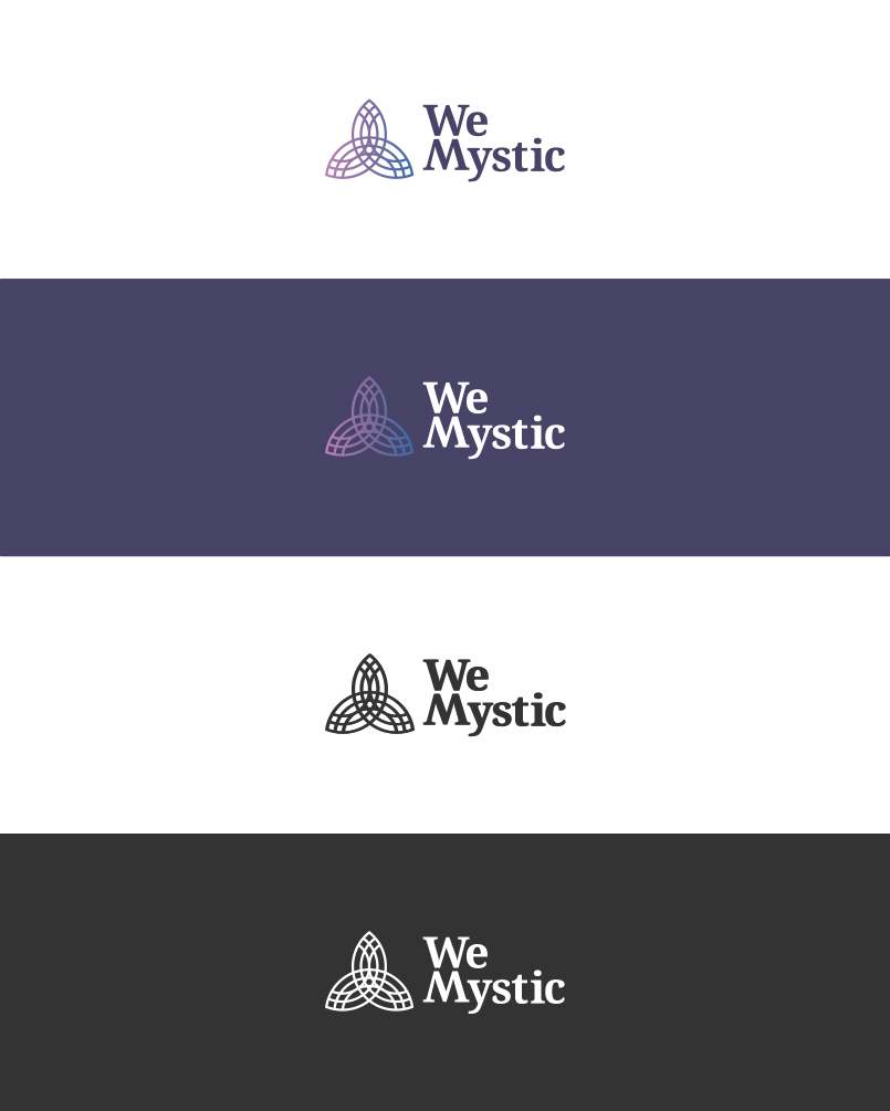
Below are every acceptable version of the WeMystic logo.


Primarily the logo should be used on a white background for maximum impact and clarity. In cases where the regular logo is not appropriate, the following versions are available for use:

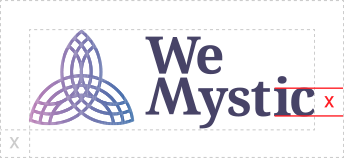
Clear space is essential in keeping the WeMystic logo free from other visual elements, logos and clutter.
The accepted clear space for both the horizontal and vertical versions of the WeMystic Logo is 1X, where: X = the height of the vertical stroke of the “ i ” in the WeMystic logo.

Because of the complex nature of the WeMystic logo, care should be taken to ensure clarity and readability at small sizes in all applications. Follow the guidelines here for the minimum sizing across different media.


The WeMystic palette consists of five bright colors and a gradient with some of these colors. These colors should be used sparingly for feature design elements.
#484367
R 72 G 67 B 103
#7F6C9D
R 127 G 108 B 157
#B67FB5
R 182 G 127 B 181
#23A0C6
R 35 G 160 B 198
#386BA9
R 56 G 107 B 169

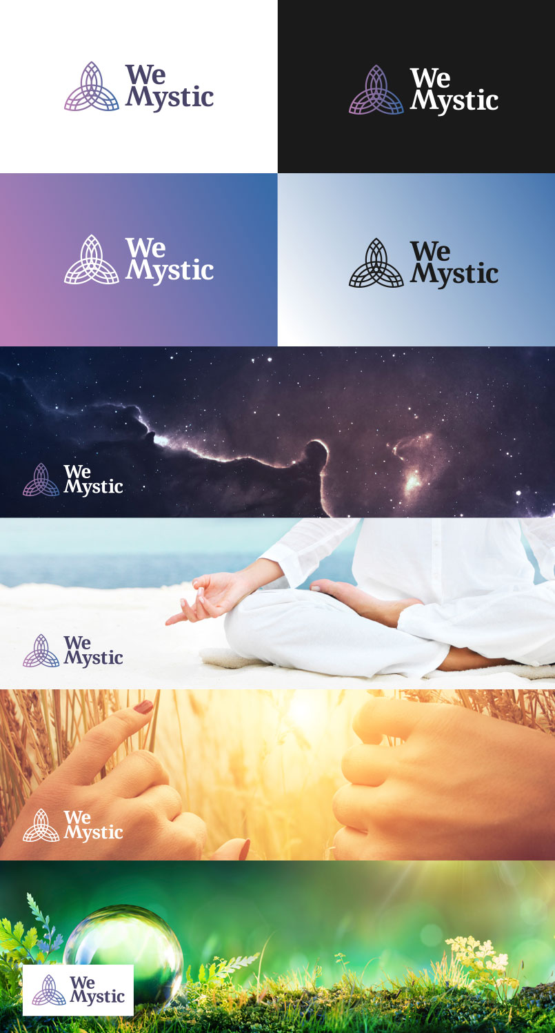
Ideally the logo is to be used on a white background for maximum impact and clarity. When this is not possible, be sure to choose background colors or photos that provide sufficient contrast with the logo.
Below are some examples of the logo used correctly in defirent circumstances.

Communications from WeMystic are most effective when the words are consistent in both content and appearance. The below font families were carefully chosen to reflect the WeMystic brand identity.
Dosis, a typeface designed by Impallari Type, was the font chosen for the headings of any WeMystic communication. It’s a clean, beautifull rounded sans-serif. All headings in WeMystic communications should bw written in all caps.
A B C D E F G H I J K L M N O P Q R S T U V W X Y Z
a b c d e f g h i j k l m n o p q r s t u v w x y z
1 2 3 4 5 6 7 8 9 0
‘ ? ’ “ ! ” ( % ) [ # ] { @ } / & < - + ÷ × = > ® © $ € £ ¥ ¢ : ; , . *
Extra-Light Light Regular Medium
Semi-Bold Bold Extra-Bold
For our body text communication, we chose to use Roboto, a sans -serif typeface design by Christian Robertson. Roboto has a dual nature. It has a mechanical skeleton and the forms are largely geometric. At the same time, the font features friendly and open curves. Roboto allows letters to be settled into their natural width. This makes for a more natural reading rhythm more commonly found in humanist and serif types.
A B C D E F G H I J K L M N O P Q R S T U V W X Y Z
a b c d e f g h i j k l m n o p q r s t u v w x y z
1 2 3 4 5 6 7 8 9 0
‘ ? ’ “ ! ” ( % ) [ # ] { @ } / & < - + ÷ × = > ® © $ € £ ¥ ¢ : ; , . *
Thin Thin Italic Light Light Italic Regular Italic Medium Medium Italic
Bold Bold Italic Black Black Italic